Gradient Border Colors with CSS
CSS3 has all the new features. With these features, we are now able to build image-less websites. Earlier, We were using image when it comes to showing gradient colors. Now, it becomes much leaner with the use of CSS3 Gradient Background.
But CSS3 Gradient does not stop only for background use. Did you know that you can also utilize it within borders? Let's see how to do this.
To form the gradient in the box borders, set a solid border on the top and bottom side of the box first. And also create 2 rectangles with 2 pseudo-elements —
And the Outcome comes as follows.

Still, we rely on 2 pseudo-elements,
The Results is as follows.

The Results is as Follows.
But CSS3 Gradient does not stop only for background use. Did you know that you can also utilize it within borders? Let's see how to do this.
First Method
The first method is by applying CSS3 Gradient within pseudo-elements. Well, let’s see how the trick works.Top To Bottom Gradient Border
We will start off with a simple gradient that spreads from top to bottom. To get started, create a box with a div, as follows.HTML
<div class="box"></div>CSS
.box { width: 400px; height: 400px; background: #eee; }To form the gradient in the box borders, set a solid border on the top and bottom side of the box first. And also create 2 rectangles with 2 pseudo-elements —
:before and :after — and specify the width in the same size as the box border width. Position the rectangles on the left and right side of the box and employ linear-gradient through background-image. You can see how this trick turns out below:HTML
<div class="box"></div>CSS
.box { margin: 50px auto; width: 250px; height: 250px; border-top: 20px solid #3ACFD5; border-bottom: 20px solid #3a4ed5; -webkit-box-sizing: border-box; -moz-box-sizing: border-box; box-sizing: border-box; background-position: 0 0, 100% 0; background-repeat: no-repeat; -webkit-background-size: 20px 100%; -moz-background-size: 20px 100%; background-size: 20px 100%; background-image: url(data:image/svg+xml;base64,PD94bWwgdmVyc2lvbj0iMS4wIiA/PjxzdmcgeG1sbnM9Imh0dHA6Ly93d3cudzMub3JnLzIwMDAvc3ZnIiB3aWR0aD0iMTAwJSIgaGVpZ2h0PSIxMDAlIiB2aWV3Qm94PSIwIDAgMSAxIiBwcmVzZXJ2ZUFzcGVjdFJhdGlvPSJub25lIj48bGluZWFyR3JhZGllbnQgaWQ9Imxlc3NoYXQtZ2VuZXJhdGVkIiBncmFkaWVudFVuaXRzPSJ1c2VyU3BhY2VPblVzZSIgeDE9IjAlIiB5MT0iMCUiIHgyPSIwJSIgeTI9IjEwMCUiPjxzdG9wIG9mZnNldD0iMCUiIHN0b3AtY29sb3I9IiMzYWNmZDUiIHN0b3Atb3BhY2l0eT0iMSIvPjxzdG9wIG9mZnNldD0iMTAwJSIgc3RvcC1jb2xvcj0iIzNhNGVkNSIgc3RvcC1vcGFjaXR5PSIxIi8+PC9saW5lYXJHcmFkaWVudD48cmVjdCB4PSIwIiB5PSIwIiB3aWR0aD0iMSIgaGVpZ2h0PSIxIiBmaWxsPSJ1cmwoI2xlc3NoYXQtZ2VuZXJhdGVkKSIgLz48L3N2Zz4=),url(data:image/svg+xml;base64,PD94bWwgdmVyc2lvbj0iMS4wIiA/PjxzdmcgeG1sbnM9Imh0dHA6Ly93d3cudzMub3JnLzIwMDAvc3ZnIiB3aWR0aD0iMTAwJSIgaGVpZ2h0PSIxMDAlIiB2aWV3Qm94PSIwIDAgMSAxIiBwcmVzZXJ2ZUFzcGVjdFJhdGlvPSJub25lIj48bGluZWFyR3JhZGllbnQgaWQ9Imxlc3NoYXQtZ2VuZXJhdGVkIiBncmFkaWVudFVuaXRzPSJ1c2VyU3BhY2VPblVzZSIgeDE9IjAlIiB5MT0iMCUiIHgyPSIwJSIgeTI9IjEwMCUiPjxzdG9wIG9mZnNldD0iMCUiIHN0b3AtY29sb3I9IiMzYWNmZDUiIHN0b3Atb3BhY2l0eT0iMSIvPjxzdG9wIG9mZnNldD0iMTAwJSIgc3RvcC1jb2xvcj0iIzNhNGVkNSIgc3RvcC1vcGFjaXR5PSIxIi8+PC9saW5lYXJHcmFkaWVudD48cmVjdCB4PSIwIiB5PSIwIiB3aWR0aD0iMSIgaGVpZ2h0PSIxIiBmaWxsPSJ1cmwoI2xlc3NoYXQtZ2VuZXJhdGVkKSIgLz48L3N2Zz4=); background-image: -webkit-linear-gradient(top, #3acfd5 0%, #3a4ed5 100%),
-webkit-linear-gradient(top, #3acfd5 0%, #3a4ed5 100%); background-image: -moz-linear-gradient(top, #3acfd5 0%, #3a4ed5 100%),
-moz-linear-gradient(top, #3acfd5 0%, #3a4ed5 100%); background-image: -o-linear-gradient(top, #3acfd5 0%, #3a4ed5 100%),
-o-linear-gradient(top, #3acfd5 0%, #3a4ed5 100%); background-image: linear-gradient(to bottom, #3acfd5 0%, #3a4ed5 100%),
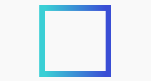
linear-gradient(to bottom, #3acfd5 0%, #3a4ed5 100%);}And the Outcome comes as follows.
Left To Right Border Gradient
Now let’s create a gradient that spans to the left and right in an identical manner to the previous example. Only, this time, we’ll add the box border on left and right side, instead of on top and bottom. Similarly, we also utilize pseudo-element —:before and :after — to shape 2 rectangles. But, contrary to the previous example, we now place them at the top and bottom side of the box.HTML
<div class="box2"></div>CSS
.box2 { margin: 50px auto; width: 250px; height: 250px; border-left: 20px solid #3ACFD5; border-right: 20px solid #3a4ed5; -webkit-box-sizing: border-box; -moz-box-sizing: border-box; box-sizing: border-box; background-position: 0 0, 0 100% ; background-repeat: no-repeat; -webkit-background-size: 100% 20px; -moz-background-size: 100% 20px; background-size: 100% 20px; background-image: url(data:image/svg+xml;base64,PD94bWwgdmVyc2lvbj0iMS4wIiA/PjxzdmcgeG1sbnM9Imh0dHA6Ly93d3cudzMub3JnLzIwMDAvc3ZnIiB3aWR0aD0iMTAwJSIgaGVpZ2h0PSIxMDAlIiB2aWV3Qm94PSIwIDAgMSAxIiBwcmVzZXJ2ZUFzcGVjdFJhdGlvPSJub25lIj48bGluZWFyR3JhZGllbnQgaWQ9Imxlc3NoYXQtZ2VuZXJhdGVkIiBncmFkaWVudFVuaXRzPSJ1c2VyU3BhY2VPblVzZSIgeDE9IjAlIiB5MT0iMCUiIHgyPSIxMDAlIiB5Mj0iMCUiPjxzdG9wIG9mZnNldD0iMCUiIHN0b3AtY29sb3I9IiMzYWNmZDUiIHN0b3Atb3BhY2l0eT0iMSIvPjxzdG9wIG9mZnNldD0iMTAwJSIgc3RvcC1jb2xvcj0iIzNhNGVkNSIgc3RvcC1vcGFjaXR5PSIxIi8+PC9saW5lYXJHcmFkaWVudD48cmVjdCB4PSIwIiB5PSIwIiB3aWR0aD0iMSIgaGVpZ2h0PSIxIiBmaWxsPSJ1cmwoI2xlc3NoYXQtZ2VuZXJhdGVkKSIgLz48L3N2Zz4=),url(data:image/svg+xml;base64,PD94bWwgdmVyc2lvbj0iMS4wIiA/PjxzdmcgeG1sbnM9Imh0dHA6Ly93d3cudzMub3JnLzIwMDAvc3ZnIiB3aWR0aD0iMTAwJSIgaGVpZ2h0PSIxMDAlIiB2aWV3Qm94PSIwIDAgMSAxIiBwcmVzZXJ2ZUFzcGVjdFJhdGlvPSJub25lIj48bGluZWFyR3JhZGllbnQgaWQ9Imxlc3NoYXQtZ2VuZXJhdGVkIiBncmFkaWVudFVuaXRzPSJ1c2VyU3BhY2VPblVzZSIgeDE9IjAlIiB5MT0iMCUiIHgyPSIxMDAlIiB5Mj0iMCUiPjxzdG9wIG9mZnNldD0iMCUiIHN0b3AtY29sb3I9IiMzYWNmZDUiIHN0b3Atb3BhY2l0eT0iMSIvPjxzdG9wIG9mZnNldD0iMTAwJSIgc3RvcC1jb2xvcj0iIzNhNGVkNSIgc3RvcC1vcGFjaXR5PSIxIi8+PC9saW5lYXJHcmFkaWVudD48cmVjdCB4PSIwIiB5PSIwIiB3aWR0aD0iMSIgaGVpZ2h0PSIxIiBmaWxsPSJ1cmwoI2xlc3NoYXQtZ2VuZXJhdGVkKSIgLz48L3N2Zz4=); background-image: -webkit-linear-gradient(left, #3acfd5 0%, #3a4ed5 100%),
-webkit-linear-gradient(left, #3acfd5 0%, #3a4ed5 100%); background-image: -moz-linear-gradient(left, #3acfd5 0%, #3a4ed5 100%),
-moz-linear-gradient(left, #3acfd5 0%, #3a4ed5 100%); background-image: -o-linear-gradient(left, #3acfd5 0%, #3a4ed5 100%),
-o-linear-gradient(left, #3acfd5 0%, #3a4ed5 100%); background-image: linear-gradient(to right, #3acfd5 0%, #3a4ed5 100%),
linear-gradient(to right, #3acfd5 0%, #3a4ed5 100%);}
Diagonal Border Gradient
Creating diagonal gradient with this trick is, well, technically complicated.Still, we rely on 2 pseudo-elements,
:before and :after and use linear-gradient. This time, however, we will employ 2 linear-gradient within the pseudo-element. And each gradient spans in opposition to one another. See the following source code for the details.HTML
<div class="box3"></div>CSS
.box3 { position: relative; width: 250px; height: 250px; margin: 50px auto; -webkit-box-sizing: border-box; -moz-box-sizing: border-box; box-sizing: border-box;}.box3:before,.box3:after { content: ""; position: absolute; width: 100%; height: 100%;}.box3:before { background-position: 0 0, 0 100% ; background-repeat: no-repeat; -webkit-background-size: 100% 20px; -moz-background-size: 100% 20px; background-size: 100% 20px; background-image: url(data:image/svg+xml;base64,PD94bWwgdmVyc2lvbj0iMS4wIiA/PjxzdmcgeG1sbnM9Imh0dHA6Ly93d3cudzMub3JnLzIwMDAvc3ZnIiB3aWR0aD0iMTAwJSIgaGVpZ2h0PSIxMDAlIiB2aWV3Qm94PSIwIDAgMSAxIiBwcmVbox3XJ2ZUFzcGVjdFJhdGlvPSJub25lIj48bGluZWFyR3JhZGllbnQgaWQ9Imxlc3NoYXQtZ2VuZXJhdGVkIiBncmFkaWVudFVuaXRzPSJ1c2VyU3BhY2VPblVbox3SIgeDE9IjAlIiB5MT0iMCUiIHgyPSIxMDAlIiB5Mj0iMCUiPjxzdG9wIG9mZnNldD0iMCUiIHN0b3AtY29sb3I9IiMzYWNmZDUiIHN0b3Atb3BhY2l0eT0iMSIvPjxzdG9wIG9mZnNldD0iMTAwJSIgc3RvcC1jb2xvcj0iIzNhOGVkNSIgc3RvcC1vcGFjaXR5PSIxIi8+PC9saW5lYXJHcmFkaWVudD48cmVjdCB4PSIwIiB5PSIwIiB3aWR0aD0iMSIgaGVpZ2h0PSIxIiBmaWxsPSJ1cmwoI2xlc3NoYXQtZ2VuZXJhdGVkKSIgLz48L3N2box34=),url(data:image/svg+xml;base64,PD94bWwgdmVyc2lvbj0iMS4wIiA/PjxzdmcgeG1sbnM9Imh0dHA6Ly93d3cudzMub3JnLzIwMDAvc3ZnIiB3aWR0aD0iMTAwJSIgaGVpZ2h0PSIxMDAlIiB2aWV3Qm94PSIwIDAgMSAxIiBwcmVbox3XJ2ZUFzcGVjdFJhdGlvPSJub25lIj48bGluZWFyR3JhZGllbnQgaWQ9Imxlc3NoYXQtZ2VuZXJhdGVkIiBncmFkaWVudFVuaXRzPSJ1c2VyU3BhY2VPblVbox3SIgeDE9IjEwMCUiIHkxPSIwJSIgeDI9IjAlIiB5Mj0iMCUiPjxzdG9wIG9mZnNldD0iMCUiIHN0b3AtY29sb3I9IiMzYTRlZDUiIHN0b3Atb3BhY2l0eT0iMSIvPjxzdG9wIG9mZnNldD0iMTAwJSIgc3RvcC1jb2xvcj0iIzNhOGVkNSIgc3RvcC1vcGFjaXR5PSIxIi8+PC9saW5lYXJHcmFkaWVudD48cmVjdCB4PSIwIiB5PSIwIiB3aWR0aD0iMSIgaGVpZ2h0PSIxIiBmaWxsPSJ1cmwoI2xlc3NoYXQtZ2VuZXJhdGVkKSIgLz48L3N2box34=); background-image: -webkit-linear-gradient(to right, #3acfd5 0%, #3a8ed5 100%),
-webkit-linear-gradient(right, #3a4ed5 0%, #3a8ed5 100%); background-image: -moz-linear-gradient(to right, #3acfd5 0%, #3a8ed5 100%),
-moz-linear-gradient(right, #3a4ed5 0%, #3a8ed5 100%); background-image: -o-linear-gradient(to right, #3acfd5 0%, #3a8ed5 100%),
-o-linear-gradient(right, #3a4ed5 0%, #3a8ed5 100%); background-image: linear-gradient(to right, #3acfd5 0%, #3a8ed5 100%),
linear-gradient(to left, #3a4ed5 0%, #3a8ed5 100%);}
.box3:after { background-position: 0 0, 100% 0; background-repeat: no-repeat;
  -webkit-background-size: 20px 100%;

  -moz-background-size: 20px 100%;

  background-size: 20px 100%;

  background-image: url(data:image/svg+xml;base64,PD94bWwgdmVyc2lvbj0iMS4wIiA/PjxzdmcgeG1sbnM9Imh0dHA6Ly93d3cudzMub3JnLzIwMDAvc3ZnIiB3aWR0aD0iMTAwJSIgaGVpZ2h0PSIxMDAlIiB2aWV3Qm94PSIwIDAgMSAxIiBwcmVbox3XJ2ZUFzcGVjdFJhdGlvPSJub25lIj48bGluZWFyR3JhZGllbnQgaWQ9Imxlc3NoYXQtZ2VuZXJhdGVkIiBncmFkaWVudFVuaXRzPSJ1c2VyU3BhY2VPblVbox3SIgeDE9IjAlIiB5MT0iMCUiIHgyPSIwJSIgeTI9IjEwMCUiPjxzdG9wIG9mZnNldD0iMCUiIHN0b3AtY29sb3I9IiMzYWNmZDUiIHN0b3Atb3BhY2l0eT0iMSIvPjxzdG9wIG9mZnNldD0iMTAwJSIgc3RvcC1jb2xvcj0iIzNhOGVkNSIgc3RvcC1vcGFjaXR5PSIxIi8+PC9saW5lYXJHcmFkaWVudD48cmVjdCB4PSIwIiB5PSIwIiB3aWR0aD0iMSIgaGVpZ2h0PSIxIiBmaWxsPSJ1cmwoI2xlc3NoYXQtZ2VuZXJhdGVkKSIgLz48L3N2box34=),url(data:image/svg+xml;base64,PD94bWwgdmVyc2lvbj0iMS4wIiA/PjxzdmcgeG1sbnM9Imh0dHA6Ly93d3cudzMub3JnLzIwMDAvc3ZnIiB3aWR0aD0iMTAwJSIgaGVpZ2h0PSIxMDAlIiB2aWV3Qm94PSIwIDAgMSAxIiBwcmVbox3XJ2ZUFzcGVjdFJhdGlvPSJub25lIj48bGluZWFyR3JhZGllbnQgaWQ9Imxlc3NoYXQtZ2VuZXJhdGVkIiBncmFkaWVudFVuaXRzPSJ1c2VyU3BhY2VPblVbox3SIgeDE9IjAlIiB5MT0iMTAwJSIgeDI9IjAlIiB5Mj0iMCUiPjxzdG9wIG9mZnNldD0iMCUiIHN0b3AtY29sb3I9IiMzYTRlZDUiIHN0b3Atb3BhY2l0eT0iMSIvPjxzdG9wIG9mZnNldD0iMTAwJSIgc3RvcC1jb2xvcj0iIzNhOGVkNSIgc3RvcC1vcGFjaXR5PSIxIi8+PC9saW5lYXJHcmFkaWVudD48cmVjdCB4PSIwIiB5PSIwIiB3aWR0aD0iMSIgaGVpZ2h0PSIxIiBmaWxsPSJ1cmwoI2xlc3NoYXQtZ2VuZXJhdGVkKSIgLz48L3N2box34=);

  background-image: -webkit-linear-gradient(top, #3acfd5 0%, #3a8ed5 100%),
-webkit-linear-gradient(to top, #3a4ed5 0%, #3a8ed5 100%);

  background-image: -moz-linear-gradient(top, #3acfd5 0%, #3a8ed5 100%),
-moz-linear-gradient(to top, #3a4ed5 0%, #3a8ed5 100%);


  background-image: -o-linear-gradient(top, #3acfd5 0%, #3a8ed5 100%),
-o-linear-gradient(to top, #3a4ed5 0%, #3a8ed5 100%);


  background-image: linear-gradient(to bottom, #3acfd5 0%, #3a8ed5 100%),
linear-gradient(to top, #3a4ed5 0%, #3a8ed5 100%);


}
Second Method
The second method is by using CSS3
border-image property. The border-image property in CSS3 allows us to fill the border with an image as well as CSS3 Gradient. The browsers support for border-image are quite great; Chrome, Internet Explorer 11, Firefox, Safari, and Opera are all capable to fully render border-image. It should be noted, however, that the border-image will only work on rectangular shapes or boxes. That means adding border-radius will deviate the border-image output.
The following is the
The <source> is the path that specifies the image used in the border. Herein, we will fill it out with CSS3 Gradient instead. To achieve the same output as in the previous examples, we apply the CSS3 Gradient within the
The
The addition of border-image-slice shown above will set the inner offsets of the
This method offers more flexibility to adjust the gradient in every possible direction; left to right, top to bottom, diagonal, or at an angle. Below are some examples:
border-image property specification:
border-image: <source> <slice> <width> <outset> <repeat|initial|inherit>; The <source> is the path that specifies the image used in the border. Herein, we will fill it out with CSS3 Gradient instead. To achieve the same output as in the previous examples, we apply the CSS3 Gradient within the
border-image, as follows.
.box{

    width: 250px;

    height: 250px;
margin: auto;
background: #eee;
border: 20px solid transparent;
-moz-border-image: -moz-linear-gradient(top, #3acfd5 0%, #3a4ed5 100%);
-webkit-border-image: -webkit-linear-gradient(top, #3acfd5 0%, #3a4ed5 100%);
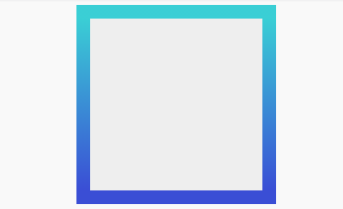
border-image: linear-gradient(to bottombottom, #3acfd5 0%, #3a4ed5 100%);
border-image-slice: 1;
}The
border-image will show nothing if we don’t specify the border-width. So, as you can see above, we add 20px of border width with transparent border-color. Then, we set the value of the border-image and linear-gradient along with the vendor prefix for earlier Webkit and Firefox versions.The addition of border-image-slice shown above will set the inner offsets of the
image-border content. This property is required to display the gradient fully within the surrounding area of the box. See the output below:This method offers more flexibility to adjust the gradient in every possible direction; left to right, top to bottom, diagonal, or at an angle. Below are some examples:
Left to right gradient
HTML
<div class="box"></div>CSS
.box{
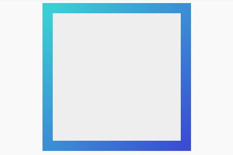
width: 250px;height: 250px;margin: auto;background: #eee;border: 20px solid transparent;-moz-border-image: -moz-linear-gradient(left, #3acfd5 0%, #3a4ed5 100%);-webkit-border-image: -webkit-linear-gradient(left, #3acfd5 0%, #3a4ed5 100%);border-image: linear-gradient(to right, #3acfd5 0%, #3a4ed5 100%);border-image-slice: 1;}The Results is as follows.
Diagonal Gradient
HTML
<div class="box"></div>CSS
.box
{
width: 250px;

height: 250px;

margin: auto;

background: #eee;

border: 20px solid transparent;

-moz-border-image: -moz-linear-gradient(top left, #3acfd5 0%, #3a4ed5 100%);

-webkit-border-image: -webkit-linear-gradient(top left, #3acfd5 0%, #3a4ed5 100%);

border-image: linear-gradient(to bottom right, #3acfd5 0%, #3a4ed5 100%);

border-image-slice: 1;

}
The Results is as Follows.

Comments
Post a Comment