Bootstrap Forms and Validations Classes
This article explains you how to create forms in Bootstrap 3. And how to create different types of forms and how to make them responsive. And also explains various validation classes that Bootstrap comes with.
Forms are very basic and important HTML components for any website. It is used for many different purposes like getting user feedback, Creating contact us forms, Making status on social media, etc. Forms are here to stay With HTML5, they have even got more powerful. It gives us new attributes which, when added to our forms, do form validation using browser's inbuilt validation capabilities.
With Bootstrap 3, we just have to place HTML forms markup and leave the styling part to it. Bootstrap has got many CSS classes and various form layouts that can be created within seconds. So let's build a basic form using Bootstrap 3.
The above is a Bootstrap recommend markup to render Bootstrap properly across all devices. It has got necessary meta tags, Bootstrap's CSS and JS from the CDN, and also the jQuery file. There are 2 different files html5shiv and respond.js which are included conditionally for IE8 to support HTML5 and CSS3.
The above markup also contains Bootstrap's container component. It's a div element with a class .container to create a fixed width layout. It is also used to wrap and position all the elements to the center of the browser window.
So, Let's get started with the forms.
To create a Bootstrap form, we need a basic HTML <form> tag. So, let's add the form tag inside the above container markup.
In this article we will be building a login form. Form will have a text field for "email", a text field for "password", a check box for "remember me" feature and finally "submit" or "login" button.
Just to be clear, in Bootstrap, most of the form elements are wrapped inside a div with a class
The above email field is given a class
Here is the markup for the form.
The form now should look like following.
In similar manner, Lets add another field for password.
 When creating radio buttons or checkbox, you don't need a
 Now, lets add submit button to the form. The markup for a button is pretty simple:
We are using Bootstrap's button classes here to give a fancy look. The classes used for creating button are .btn and .btn-success. The first class is used to add Bootstrap's common styles for buttons and the second class is for the color. Let's add this button now.
Finally, our basic form should look like following.

Go ahead and click on the submit button. You will find that the form was submitted without any validation. We have to attach
 Amazing! isn't it?
Text fields will look like following for above classes.

Add these validation classes along with the
You can also display fancy icons beside each text field when validating. For example:

To add a helper text below each form element, add a span with a class
To control the size of each form element, use the following classes along with .form-control class:
Forms are very basic and important HTML components for any website. It is used for many different purposes like getting user feedback, Creating contact us forms, Making status on social media, etc. Forms are here to stay With HTML5, they have even got more powerful. It gives us new attributes which, when added to our forms, do form validation using browser's inbuilt validation capabilities.
With Bootstrap 3, we just have to place HTML forms markup and leave the styling part to it. Bootstrap has got many CSS classes and various form layouts that can be created within seconds. So let's build a basic form using Bootstrap 3.
Getting started with Bootstrap 3 forms
Before we jump into creating forms, we just need to setup Bootstrap files and an html page. So following is the markup of HTML file.
HTML Code:
<!DOCTYPE html><html lang="en"> <head> <meta charset="utf-8"> <meta http-equiv="X-UA-Compatible" content="IE=edge"> <meta name="viewport" content="width=device-width, initial-scale=1"> <title>Forms in Bootstrap - Demo</title>
<!-- Bootstrap --> <link rel="stylesheet" href="//maxcdn.bootstrapcdn.com/bootstrap/3.2.0/css/bootstrap.min.css">
<!-- HTML5 Shim and Respond.js IE8 support of HTML5 elements and media queries --> <!-- WARNING: Respond.js doesn't work if you view the page via file:// --> <!--[if lt IE 9]> <script src="https://oss.maxcdn.com/html5shiv/3.7.2/html5shiv.min.js"></script> <script src="https://oss.maxcdn.com/respond/1.4.2/respond.min.js"></script> <![endif]--> </head> <body> <div class="container"> <h1>Hello World</h1> </div>
<script src="https://ajax.googleapis.com/ajax/libs/jquery/1.11.1/jquery.min.js"></script> <script src="//maxcdn.bootstrapcdn.com/bootstrap/3.2.0/js/bootstrap.min.js"></script> </body></html>The above is a Bootstrap recommend markup to render Bootstrap properly across all devices. It has got necessary meta tags, Bootstrap's CSS and JS from the CDN, and also the jQuery file. There are 2 different files html5shiv and respond.js which are included conditionally for IE8 to support HTML5 and CSS3.
The above markup also contains Bootstrap's container component. It's a div element with a class .container to create a fixed width layout. It is also used to wrap and position all the elements to the center of the browser window.
So, Let's get started with the forms.
To create a Bootstrap form, we need a basic HTML <form> tag. So, let's add the form tag inside the above container markup.
<form>

</form>
In this article we will be building a login form. Form will have a text field for "email", a text field for "password", a check box for "remember me" feature and finally "submit" or "login" button.
Just to be clear, in Bootstrap, most of the form elements are wrapped inside a div with a class
.form-group. It holds the label as well as the form element properly. Let's create an "email" field using this form group.
<form>

 <div class="form-group">

  <label for="emailField">Email address</label>

  <input type="email" class="form-control" id="emailField" placeholder="Enter email">

 </div>

</form>
The above email field is given a class
.form-control to remove default browser style and apply Bootstrap's style. We have used the type as email to add the HTML5's client side email validation functionality.Here is the markup for the form.
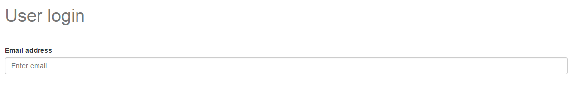
<div class="container">

 <h1 class="text-muted">User login</h1>

 <hr/>

    <form>

     <div class="form-group">

      <label for="emailField">Email address</label>

   <input type="email" class="form-control" id="emailField" placeholder="Enter email">

     </div>

    </form>

</div>
The form now should look like following.
<div class="container">

 <h1 class="text-muted">User login</h1>

 <hr/>

    <form>

     <div class="form-group">

      <label for="emailField">Email address</label>

   <input type="email" class="form-control" id="emailField" placeholder="Enter email">

     </div>

     <div class="form-group">

      <label for="passwordField">Password</label>

   <input type="password" class="form-control" id="passwordField" placeholder="Enter password">

     </div>

    </form>

</div>
.form-group element. Instead, we have got wrappers like .checkbox and .radio for them respectively.
<div class="checkbox">

 <label>

  <input type="checkbox"> Checkbox label here

 </label>

</div>


<div class="radio">

 <label>

  <input type="radio"> Radio label here

 </label>

</div>
<form>

 <div class="form-group">

  <label for="emailField">Email address</label>

  <input type="email" class="form-control" id="emailField" placeholder="Enter email">

 </div>


 <div class="form-group">

  <label for="passwordField">Password</label>

  <input type="password" class="form-control" id="passwordField" placeholder="Enter password">

 </div>


 <div class="checkbox">

  <label>

      <input type="checkbox" /> Remember Me

  </label>

 </div>


</form>
<button type="submit" class="btn btn-success">Login</button>We are using Bootstrap's button classes here to give a fancy look. The classes used for creating button are .btn and .btn-success. The first class is used to add Bootstrap's common styles for buttons and the second class is for the color. Let's add this button now.
Finally, our basic form should look like following.
required attribute for validations to work. Here's the final markup:
<div class="container">

 <h1 class="text-muted">User login</h1>

 <hr/>

    <form>

     <div class="form-group">

      <label for="emailField">Email address</label>

   <input type="email" class="form-control" id="emailField" placeholder="Enter email" required>

     </div>


     <div class="form-group">

      <label for="passwordField">Email address</label>

   <input type="password" class="form-control" id="passwordField" placeholder="Enter password" required>

     </div>


     <div class="checkbox">

      <label>

       <input type="checkbox" required/> Remember Me

      </label>

     </div>


     <button type="submit" class="btn btn-success">Login</button>

    </form>

</div>
Bootstrap Inline Forms
Sometimes, we may need to create a form in which all the form elements are placed horizontally. This is mostly found in forms placed in top bar where amount of space is very less. Bootstrap has got support for creating inline forms too.
We just need a single class to convert the above form into an inline form. Add class
.form-inline to the <form> element in the above markup.
The form gets converted into following:
Validation Classes
If you want to ignore the HTML5's form validation and write your own JavaScript codes, you may want to use many validation classes provided by Bootstrap. These classes will give your form a better user experience. Let's check them out.
.has-success: applies a green border to the text field..has-warning: applies a brown border to the text field..has-error: applies a red border to the text field.
Add these validation classes along with the
.form-control class.You can also display fancy icons beside each text field when validating. For example:
<div class="form-group has-success has-feedback">

  <input type="text" class="form-control">

  <span class="glyphicon glyphicon-ok form-control-feedback"></span>

</div>
.has-feedback to the .form-group element and class .form-control-feedback to the span element. The icon used above is Glyphicon icon that comes along with Bootstrap's package.To add a helper text below each form element, add a span with a class
.help-block.
<input type="email" class="form-control">

<span class="help-block">Enter a valid Email address.</span>
Form control sizing
To control the size of each form element, use the following classes along with .form-control class:
.input-lg: Creates a large input field..input-sm: Creates a smaller input field.None: Creates a default size input field.
Form Elements Support
The class
.form-control can be attached with following elements:- All the HTML5 text fields: text, password, datetime, datetime-local, date, month, time, week, number, email, url, search, tel, and color.
<textarea> and<select>
Wrap Up
Hopefully, you have got a good understanding about Bootstrap forms. As always, you can override these styles and write custom CSS of your own. Thanks for reading. :)


Comments
Post a Comment